Fruit CBD Seltzer
Brandingaugust 2020
Moodboard
To begin this branding project, I started off with using Pinterest to gather inspiration. I included imagery that inspired me for the mood, color pallete, illustration style, and typography for my imaginary Seltzer brand. I compiled my findings into a mood board so I could reference it throughout my design process and use it was a method to make sure I didn’t stray from my original concept.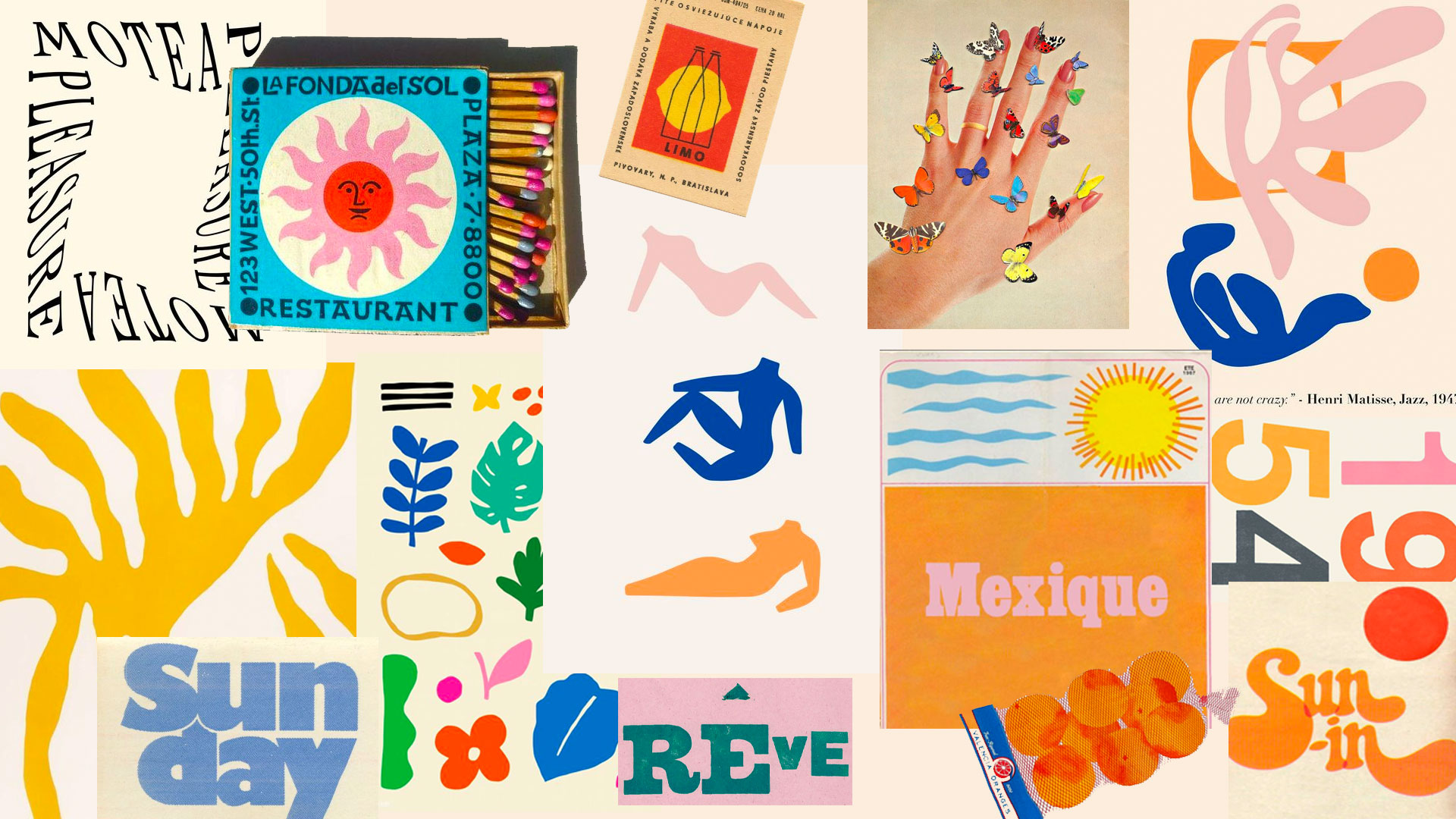
Process
Below documents how I ended up with the final design. I played with scale, color and layout all while mocking up the design on a can to see it in practice. In these steps you can see I am playing with balancing all the elements that come together to be the final design.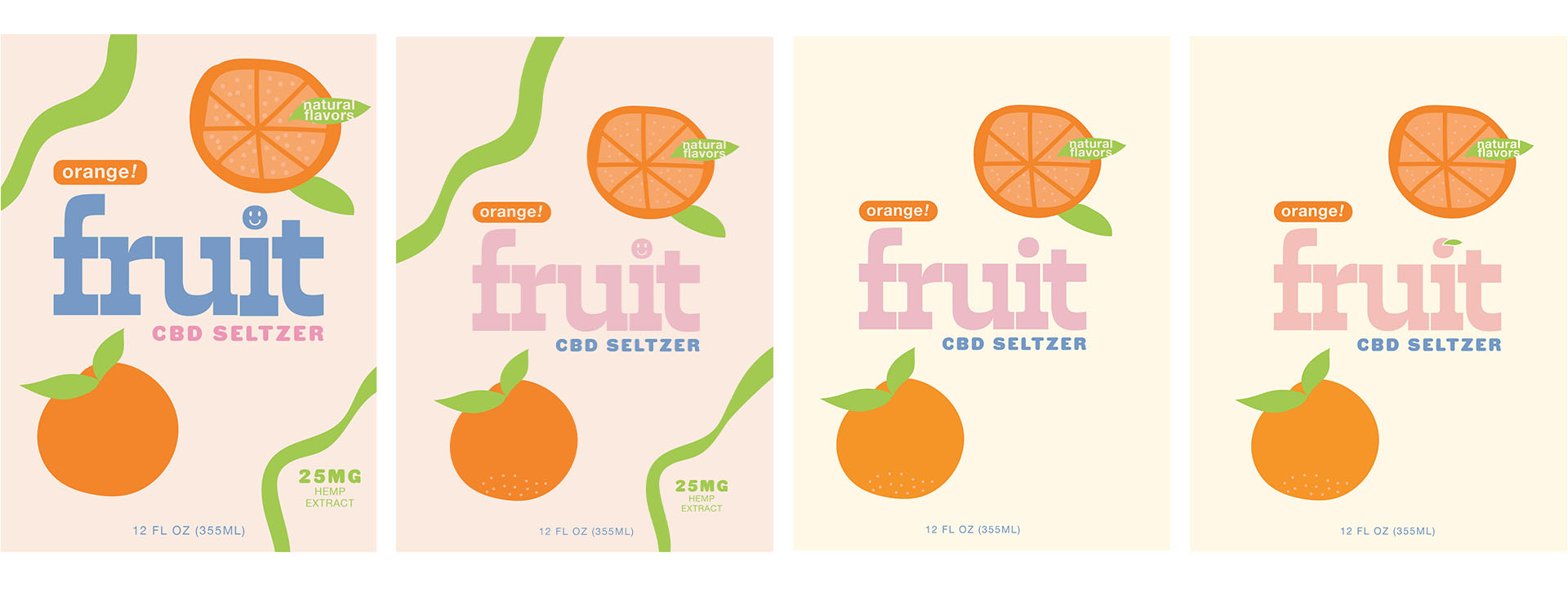
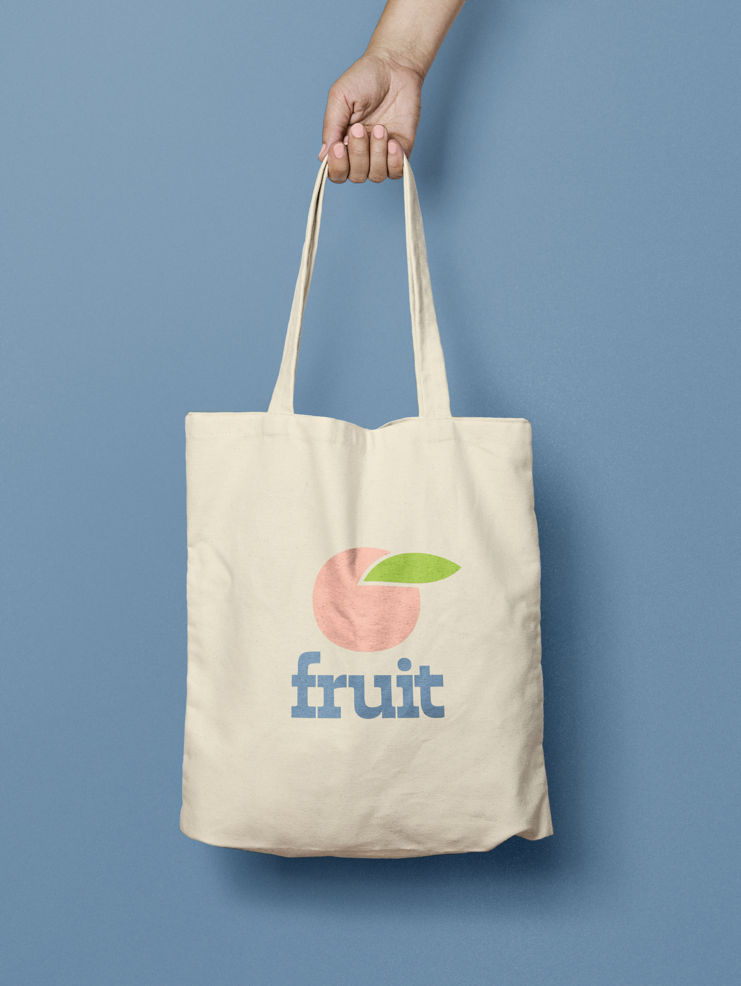
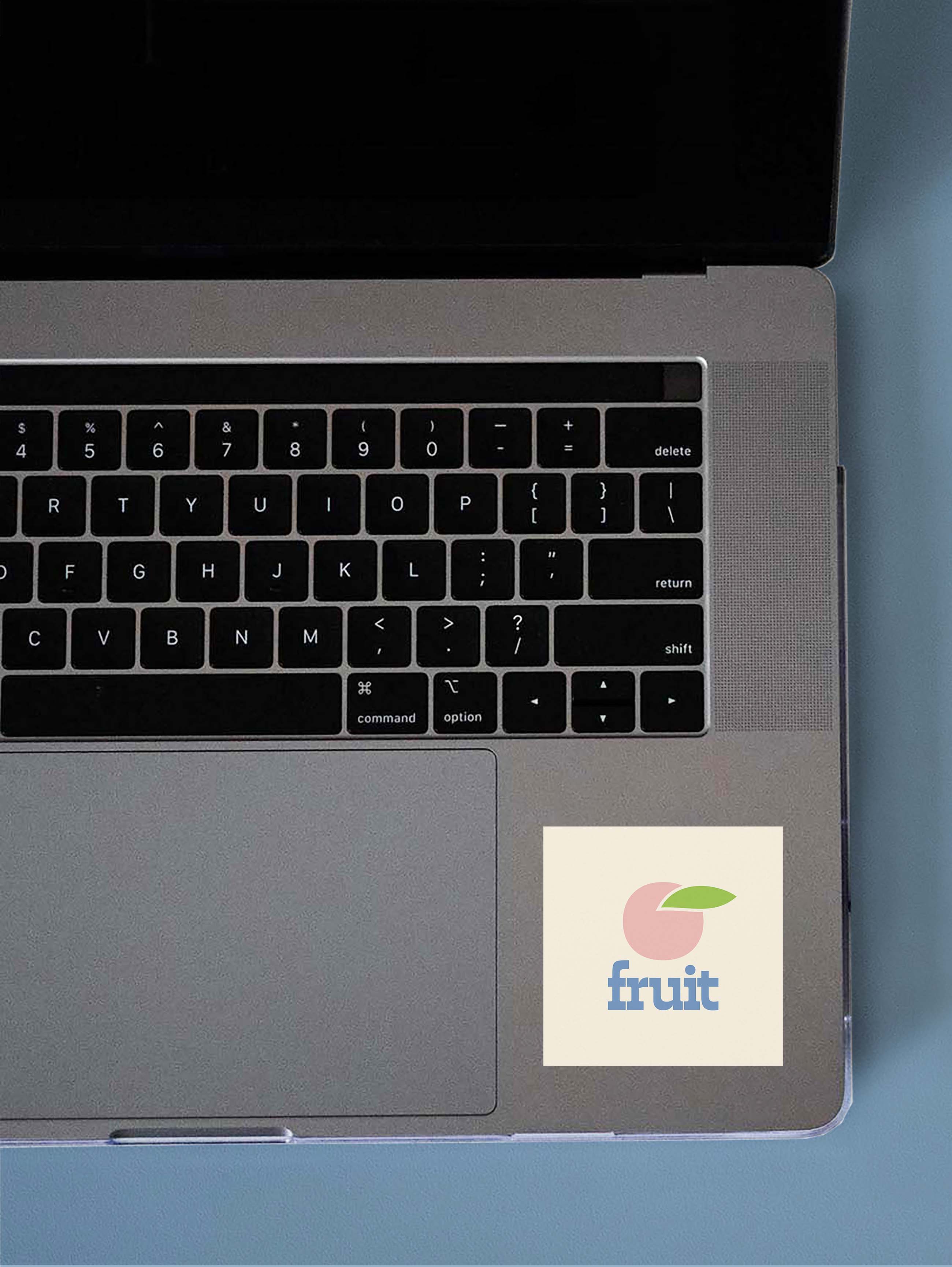
Final Branding
My initial idea was I wanted to create a seltzer that someone would stumble upon in a bodega and be excited to try. FRUIT’s packaging is bold & colorful, just like the beverage inside the cans. For the logo I created two iterations, one focusing on the ambiguous fruit icon, and the second a bold typographic logo incorporating the icon into the dot on the letter I. For each flavor profile I included an additional accent color, and blocky illustrations of the fruit.
![]()
![]()


Marketing
I designed wheat pastings that would be put across a city to market the product. I chose to include fruit puns to add to the brand’s fun tone of voice.

Typeset in EB Garamound and Karla