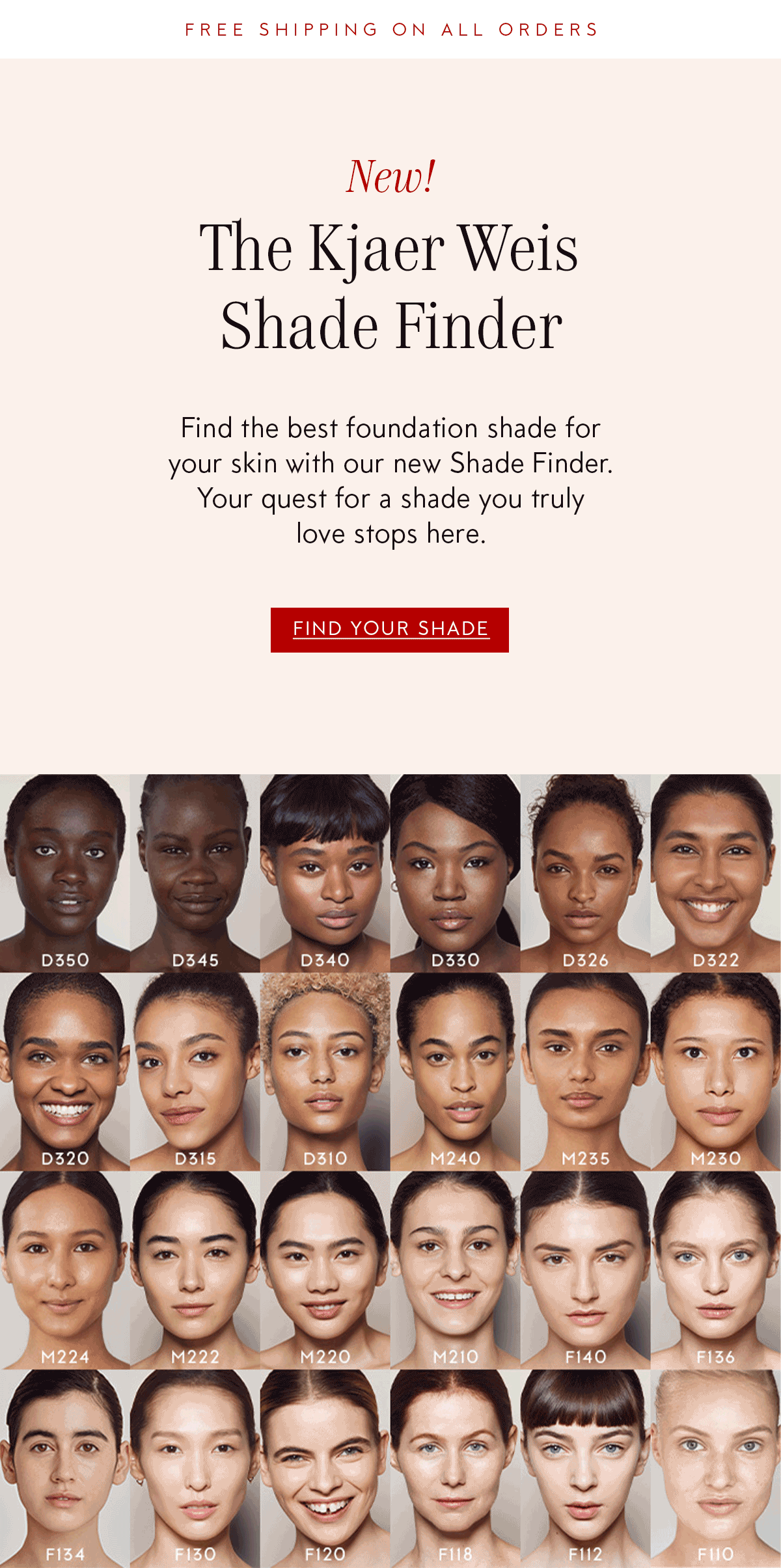
Kjaer Weis Shade Finder
UX DesignSummer of 2021, Kjaer Weis launched its online Shade Finder, a tool for customers to use to be virtually matched with their foundation shade. Our tool had 3 components.
- The ability to submit a selfie to our Pro Artists, who would then match you with a shade.
-
A Competitive assessment, that would match you with a shade based off of your foundation shade at a different beauty company.
- A quiz you could take that would pair you with a foundation shade.
Desktop
I designed the experience of this tool for both Desktop & Mobile. My process began with viewing other Shade Finder tools, and seeing what they did well or not so well. It was important for me that the tool is efficient and easy to use. This means making sure all your options are clear and that there is no need for excessive scrolling no matter your shade.Mobile
The design of the tool on mobile was especially important, because most people who come to the KW website, visit on their phone. I made sure that on mobile you do not need to scroll to see any of your options, that the text is legible, while still not sacrificing the beautiful design.Emails
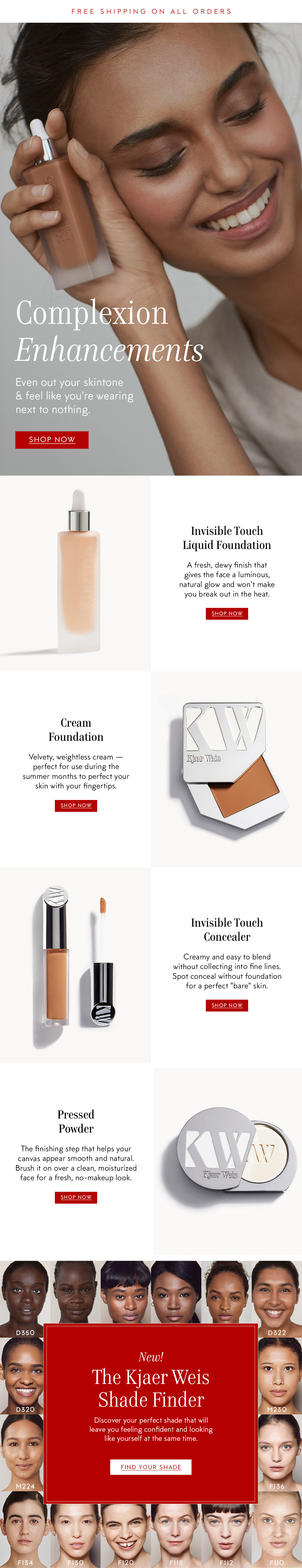
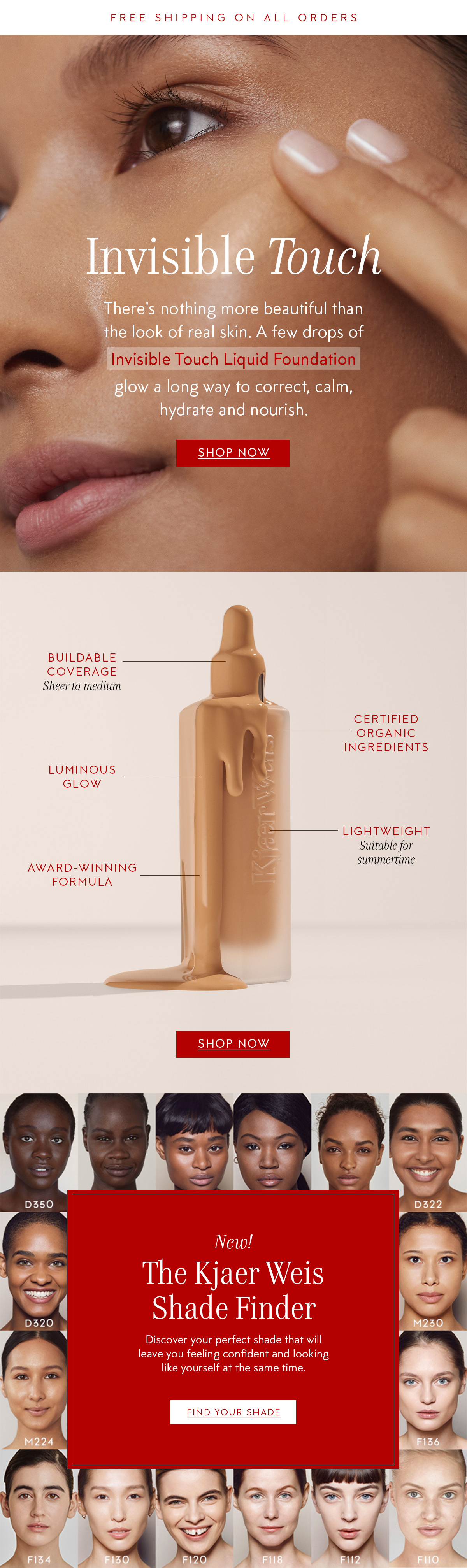
I designed a few emails used to support the launch of the tool. The first email announces the launch of the tool, and the 2 additional emails support our complexion products and have a footer that drives to the tool.LAUNCH![]()
COMPEXION OVERVIEW
![]()
HERO SKU
![]()
Typeset in EB Garamound and Karla