Pura Vida
Email Campaigns2025 - present
New Product Launches
![]()
![]()
![]()
![]()
![]()
![]()
Holiday Campaigns


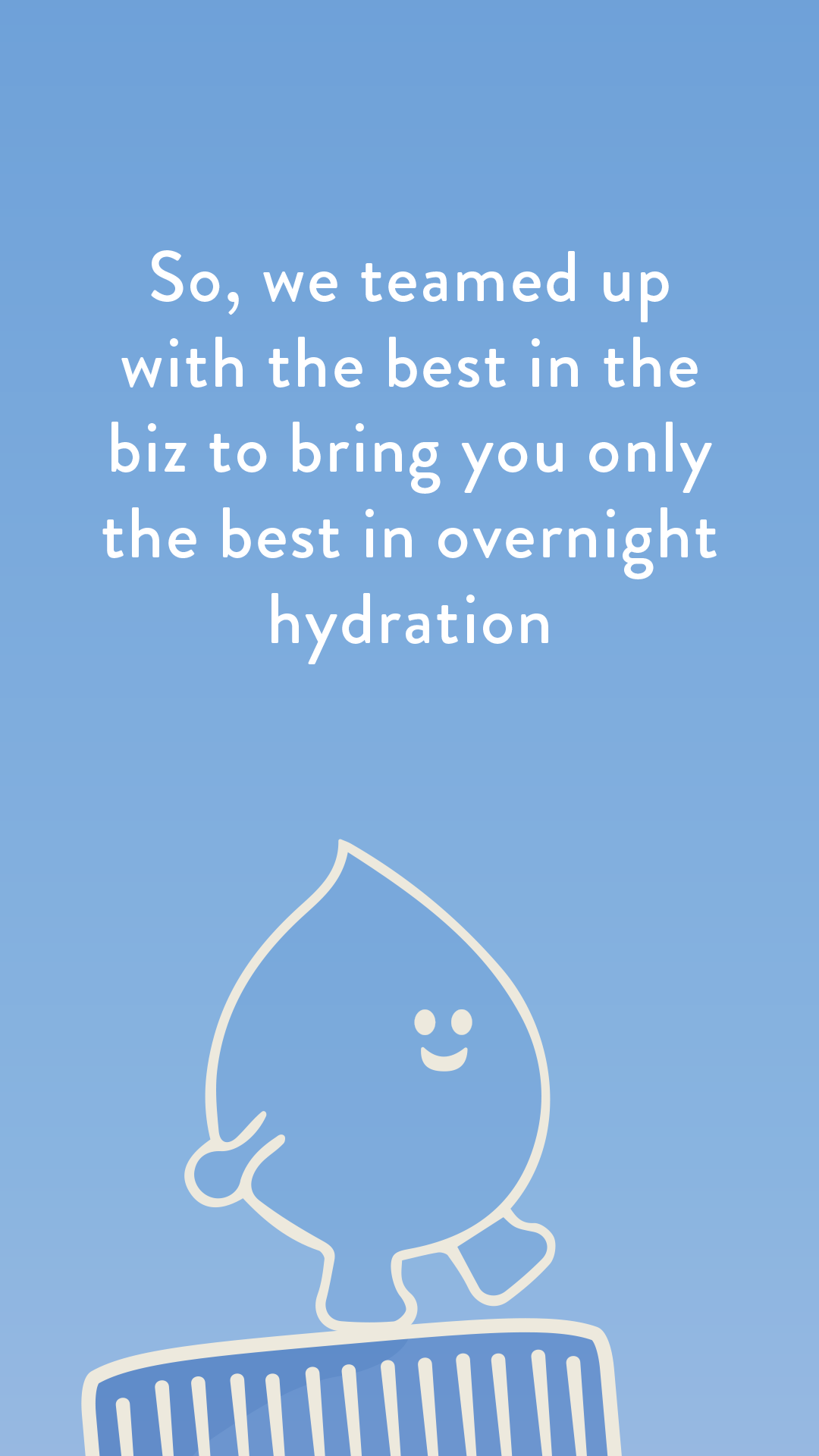
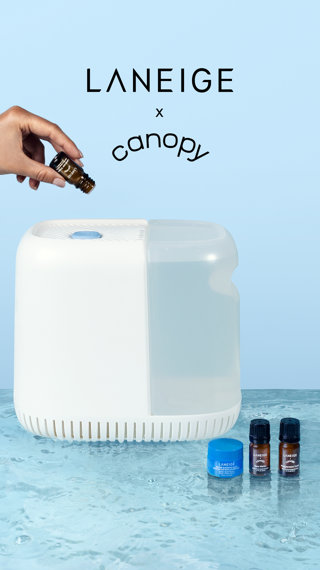
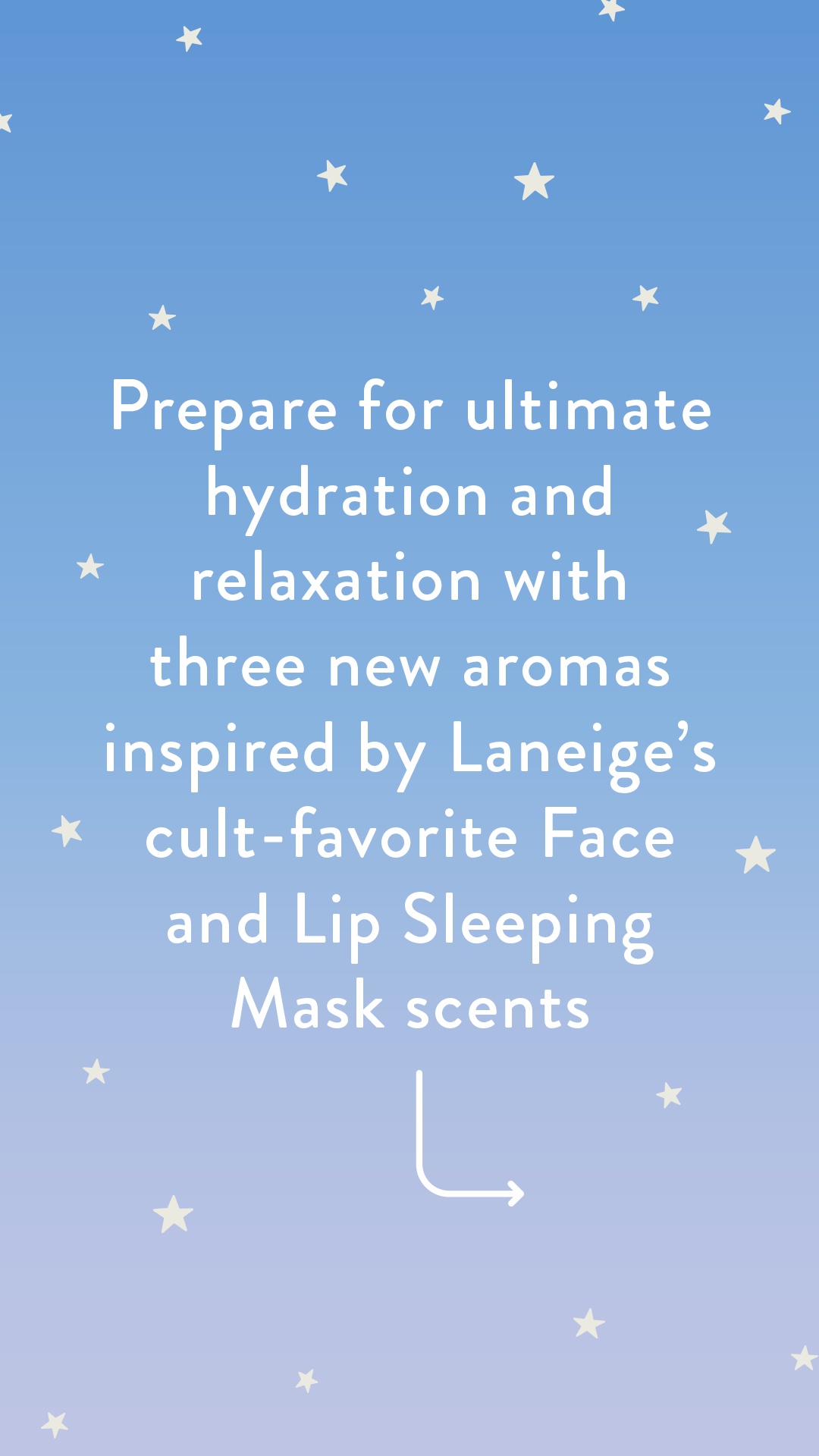
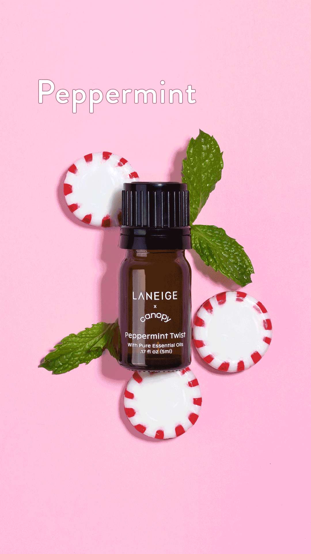
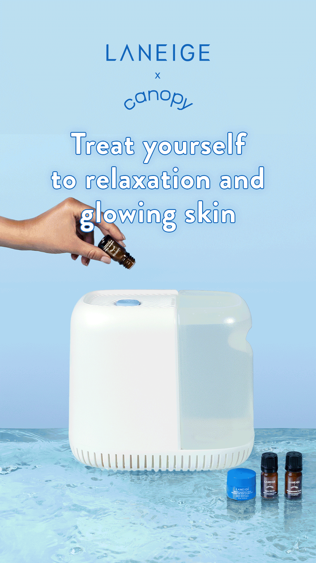
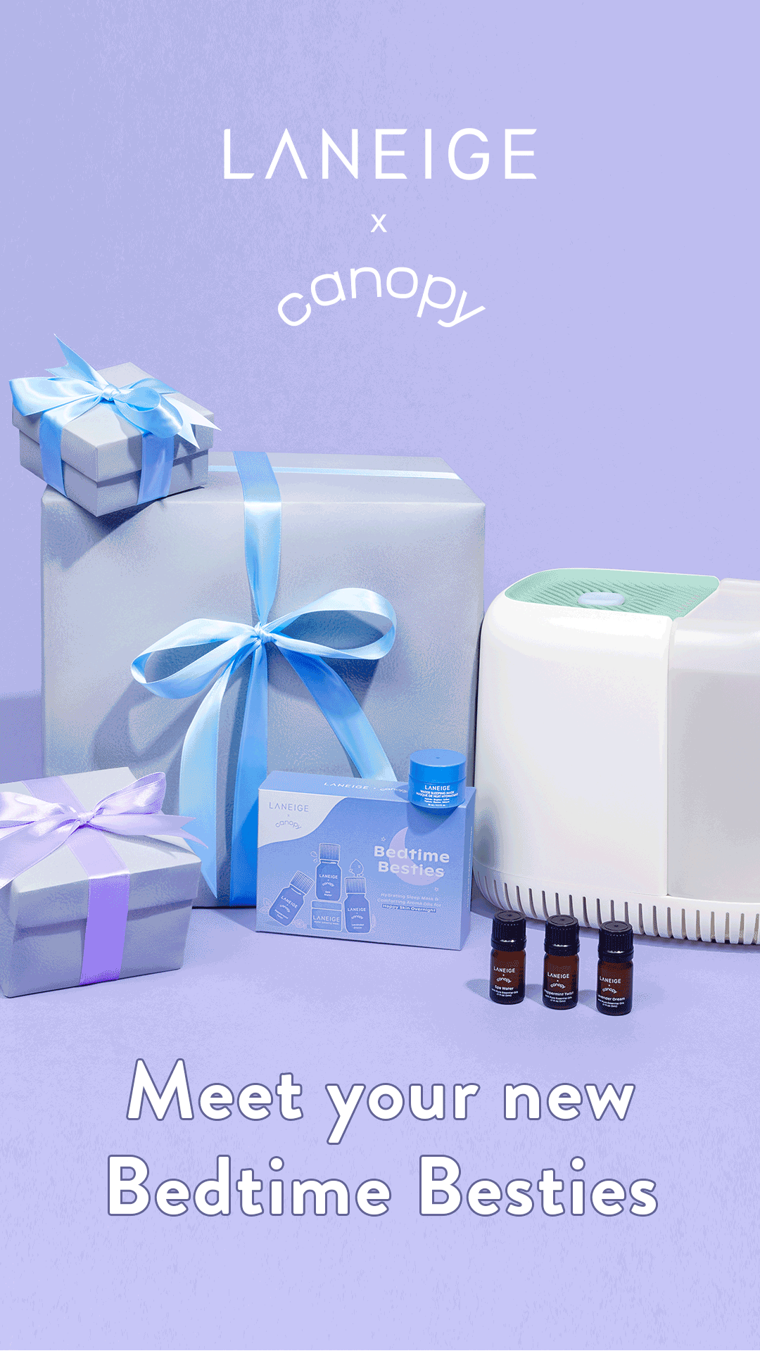
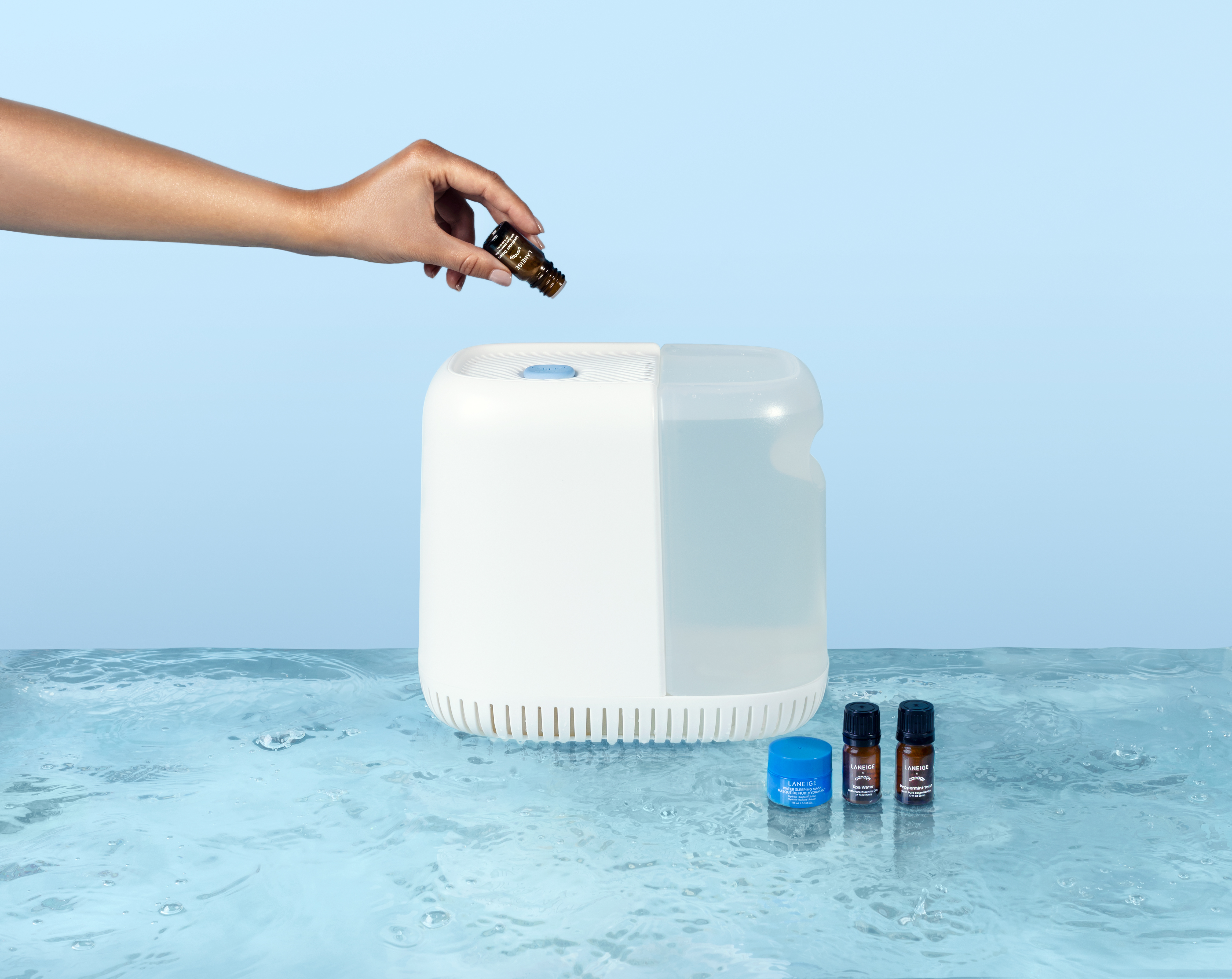
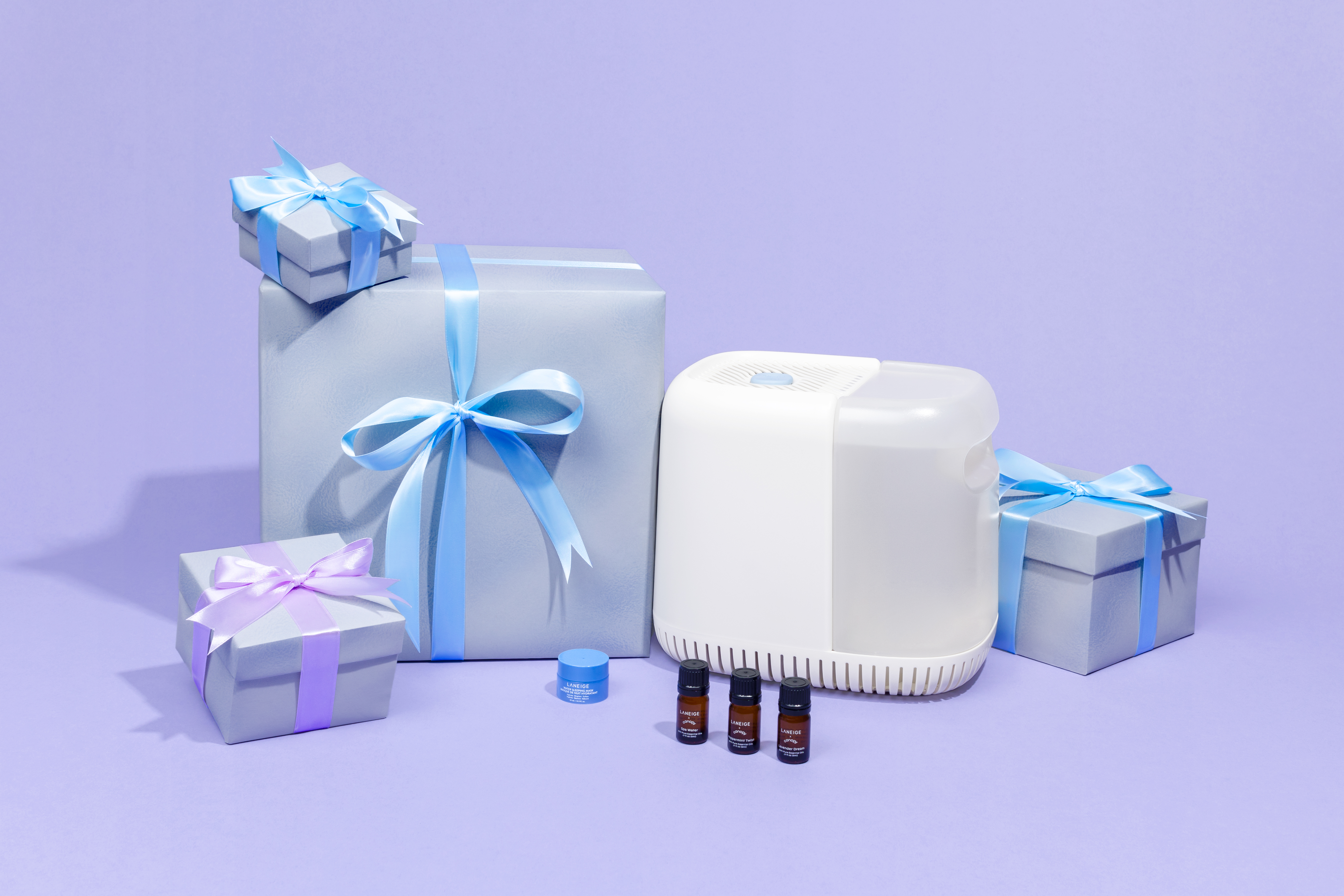
Canopy x Laneige
Partnershipoctober 2022
sephora.com
sephora.com
About
Canopy and Laneige came together to make a kit that includes 3 aromas inspired by Laneige’s cult-favorite products, plus a sample of their Water Sleeping Mask. I was leading the creative on this project, from designing the packaging and Organic & Paid Social content, to art directing the launch imagery.


Social Teaser Content


Social Launch Content


Paid Ads
Photography


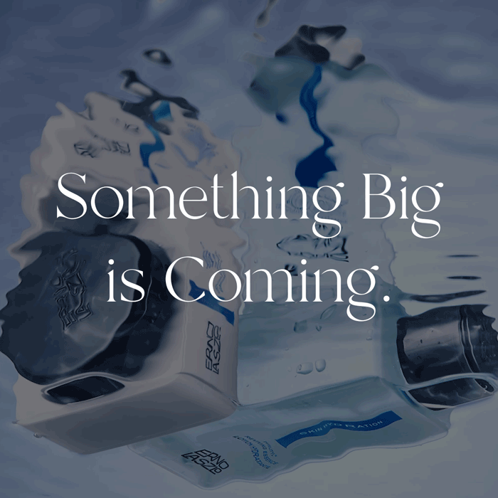
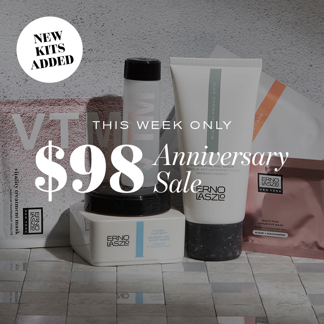
Erno Laszlo
98 Anniversary Campaign2025
Website
Homepage Banner Desktop
![]()

Homepage Banner Mobile
![]()

Email Campaigns & SMS


Erno Laszlo
Shake-It Landing PageDesigned and built this custom landing page utlizing Shogun Page-Builder to showcase Erno Laszlo’s signature product, their Shake-It Foundation.


Rebel
Design RefreshHomepage Banners


Welcome Flow


Abandonment Flows


Typeset in EB Garamound and Karla